Icons or Words? Choosing the Right Label for a Shared Bin
Choose a shared-bin label that makes its sorting rule clear, helping visitors distinguish accepted items from lookalikes before they discard them.
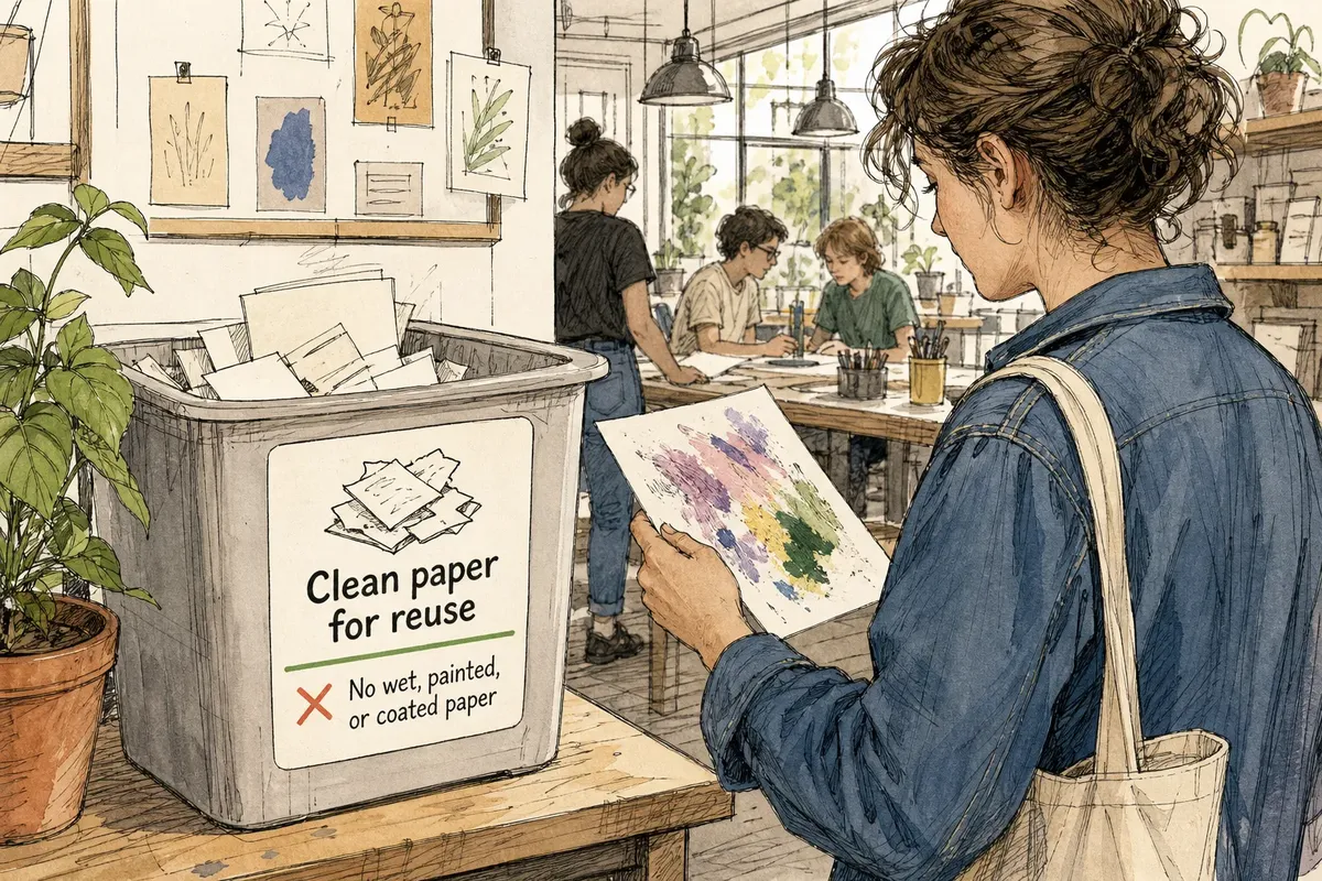
The most common mistake with a shared-bin label is naming a broad category and assuming that settles the choice. A bin marked “Paper” may invite items its organizers never intended to collect, leaving visitors to guess and staff to sort the results. A useful shared-bin label makes the actual boundary visible.
Imagine a community workshop with a container for clean paper scraps that can be reused for notes and sketches. Visitors arrive with different experience of the space, and some have never seen its sorting rules. The organizer needs a label that distinguishes reusable scraps from paper that should go elsewhere.
Define the sorting boundary before choosing a design
Start by writing down what belongs in the bin and what does not. “Clean paper for reuse” names both the material and its intended condition; “Paper” leaves room for coated packaging, wet sheets, or painted scraps.
That distinction is the label’s job. It should make the local rule legible, not merely identify the general subject of the container. If the rule is difficult to state plainly, settle the rule before adding a picture or polishing the layout.
Put the accepted category first. Add an exclusion only when it addresses a likely confusion.
Words explain conditions that a picture cannot carry
Short wording can distinguish an item’s condition or intended use. “Clean paper for reuse” says more than a drawing of a sheet, while “No wet or painted paper” names exclusions directly.
Text can also create friction. Small lettering, unfamiliar language, or a long list of exceptions may go unread by someone carrying materials. Keep the main instruction brief and place any extra detail where a visitor can pause to read it.
Use a pictogram to identify the material, not the whole rule
A simple picture of paper scraps beside a container can help someone notice the label quickly. It may also offer a visual cue to people who do not read the written language comfortably.
Yet a sheet icon cannot reliably show whether paper is clean, reusable, coated, or acceptable under a particular workshop’s rules. Even a recycling symbol may suggest a broad destination rather than this bin’s specific purpose. Use the image to reinforce the category, and let concise wording explain the boundary.
Place the instruction where a visitor can act on it
Position the label on the side people approach, near enough to the opening that they see it before discarding an item. Choose clear contrast and lettering that can be read without leaning over the bin. Keep decorative marks, logos, and extra symbols from competing with the instruction.
For the workshop, the organizer could place a plain drawing of paper scraps beside the words “Clean paper for reuse.” The picture draws attention; the wording identifies the condition and purpose. Together, they help a visitor decide what to do without asking the image to communicate a detailed rule.
Check whether the label resolves the likely confusion
- Accepted contents: Check whether the wording names the intended material and condition. If it does, keep it; if not, replace a broad category such as “Paper” with a specific phrase such as “Clean paper for reuse.”
- Likely lookalikes: Check whether visitors may confuse accepted items with wet, painted, or coated paper. If one confusion is likely, add that concise exclusion; if not, leave out a list that would bury the main rule.
- Picture meaning: Check whether the pictogram could describe a broader category than the bin accepts. If so, retain it only alongside clarifying words; if the image is itself confusing, remove it and make the wording more prominent.
- Reading conditions: Check whether the main instruction is legible from the approach side. If it is difficult to read, enlarge or shorten the wording; if the location makes reading impractical, move the label where a visitor can pause.
- Language access: Check whether the people using the space understand the label’s language. If some do not, add a concise translation or a supporting picture; if the rule still depends on a fine distinction, keep the written explanation rather than relying on the picture alone.
- Visual competition: Check whether logos, decoration, or extra symbols draw attention away from the instruction. If they do, remove or simplify them; if they do not, keep the layout as it is.
Ask someone unfamiliar with the workshop’s routine what they think belongs in the bin. Their answer can show whether the label communicates the rule or only looks familiar to its designer.
What should a shared-bin label clarify?
How should a label handle several languages?
Use short wording in the languages relevant to the people using the space, and keep each version easy to scan. A pictogram can support the text, but it should not replace a precise condition or local rule.
When can an icon stand alone?
An icon may be enough when the bin accepts a simple, readily recognizable category and there is little ambiguity about its use. If acceptance depends on condition, material, or a local rule, add words that state the boundary.
Should the label list every excluded item?
Usually, no: lead with what belongs and name only exclusions likely to prevent a common misunderstanding. Put extended sorting details nearby if visitors need them for unusual items.
What should change if visitors still misread the label?
Identify what they are misreading before revising the design. If they misunderstand the category, clarify the wording; if they overlook a condition, state it directly; if they never see the label, move it into their line of approach.
Let the words state the local rule
In the imagined workshop, a visitor holds a paint-marked sheet and sees a bin marked “Clean paper for reuse” beside a paper-scrap pictogram. The starting item is visibly painted, so the visitor can compare it with the stated condition and choose not to put it in the bin. The pictogram draws attention, but the words supply the deciding detail.
A good shared-bin label is not the most elaborate one; it is the one that states the actual sorting rule where someone must act. Keep the category precise, add a picture only when it supports that wording, and revise whichever part leaves visitors guessing.